
Book and Cover design are I think one of the most visual aspects of creating a novel. Every book I’ve come to love has usually begun as something I read or a cover I spied while scanning the aisles at a store. Its pretty damn pretentious of me to judge a book by its cover, but I like a certain feel from a novel when I see its cover. The cover in a way draws my interest as it tells an idea of the kind of story I can expect. If I see high flying ships I think of space opera, I see a woman with a dark background I think urban fantasy. I think when I comes down to it, a cover needs to be evocative of the themes that the book itself presents.
.jpg/revision/latest?cb=20130705192338)
The art for Leviathan Wakes depicts the depths of space and a large technological construct. The art itself is a “painterly” or pastel looking and fits the name of the overall series of the books, “The Expanse”. A political thriller genre with a cover that invokes the depths of the black, and yet gives a sense something lurking beneath the depths. This then leads to the discussion that came about in the design of the digital and paperback cover for Threefold Seer.
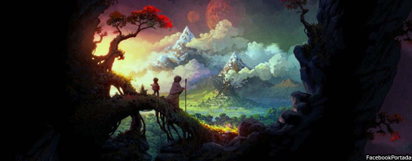
Getting ideas for the Threefold cover wasn’t hard. I would often look at the covers for Japanese variants of Game of Thrones which have a distinctive manga style of art that personally appeals to me. In a way because Threefold is a non-traditional fantasy I wanted it to link up more with eastern media rather than western. Yet, the inspiration for the world itself in Threefold was art from Legend of Zelda series. All in all the art itself was to be much like that of Leviathan wakes. Except in this case we wanted to for something a bit warmer.

So I looked at the art behind the disk sets for the Legend of Korra series. Not really a book, but the art style was reminiscent of what we wanted, a painterly style that edges between oil painting and watercolor. A feel that melds western media with the eastern roots that gave rise to the Threefold series. We originally wanted to feature all three of the “Seers” in a triangular formation. However, how to orient them or what else would go on the cover became an even wider debate. For the cover commission we needed to be able to describe what we wanted. We also needed an idea to hire an artist so they could properly quote us a price.
DasWyrd is not a large publishing house, our total staff numbers three, and most of us have day jobs (or like me being a college student) meaning we have constraints on what we’re capable of. Larger established groups can easily locate artists, or have in-house designers. I know that one guest lecturer during my previous semester was a creative director for his author. We have an artistic director, Andrea Khoo, who is also doing artwork for Land in the Stars.
She and I considered different designs and then finally I settled on a simplistic background with one of the m ain characters featured front and center. This allows us to create thematic trilogies as the series expands. For now we plan on featuring one of the three iconic Seers on the cover of each volume. We hope this will create a connection for fans and for also each book down the road. Scene wise we hope to feature major emblems from the novel itself such as the mark of the Threefold and the Divine Emblems of the seers.
We wanted to go with a simplified character focused image rather than a typical complex digital painting. An image that centers the cover on the personalities that drive the story, and the characters who we hope will build our brand.